Typography // Task 3: Type Design and Communication
Hasnol Rafiq Bin Hasnol Raduan / 0356767
Typography / Bachelor of Design (Hons) in Creative Media / Taylor's Design School
Task 3: Type Design and Communication
LECTURES
Lecture notes - Task 1: Exercises
Typography Briefing & Demo
We were tasked with conducting in-depth research and deconstructing two to
three of the required letter formats. It was suggested that we pick more
complicated letter shapes to dissect; essentially, an ascender and a
descender would provide us a solid foundation from which to work.
We must give designs that are representational of the letters we will be
developing, plus a few carefully chosen letters that show potential design.
INSTRUCTIONS
In order to create fonts, we must first understand what makes a font. The
font design must follow the fundamental rules of typography and each
typeface sketches must be mindful of these guidelines.
Set Width - Each letterform has a predetermined width, which includes the width of the form itself as well as the margins needed on each side to avoid letters overlapping. Units are completely arbitrary measurements that vary from system to system and are used to indicate set widths.
Overshoot - In most cases, the major components of a letter are located
between the baseline and the x-height, or cap height. When rounded letters
(such O or n) stretch just above or just below those lines, that is known as
overshoot. The optical effect that results from this tiny overshoot makes
the letters appear to be the same size in relation to flat (non-rounded)
characters like L or H.

|
| Figure 1.1 - Set Width |
Set Width - Each letterform has a predetermined width, which includes the width of the form itself as well as the margins needed on each side to avoid letters overlapping. Units are completely arbitrary measurements that vary from system to system and are used to indicate set widths.
Reference - Kane, John. A Type Primer2nd Ed by John Kane. King, 2011.

|
|
Figure 1.2 - Overshoot |
Reference - “The Art of Eyeballing – Part III: Overshooting: Learn –
Scannerlicker!” Learn,
https://learn.scannerlicker.net/2014/09/03/the-art-of-eyeballing-part-3-overshooting/.

|
|
Figure 1.3 - X Height |
Reference - Peate, Stephen. “What Is X Height in Typography? the Complete x Height
Definition.” Fabrik Brands, 26 May 2022,
https://fabrikbrands.com/what-is-x-height-in-typography/.
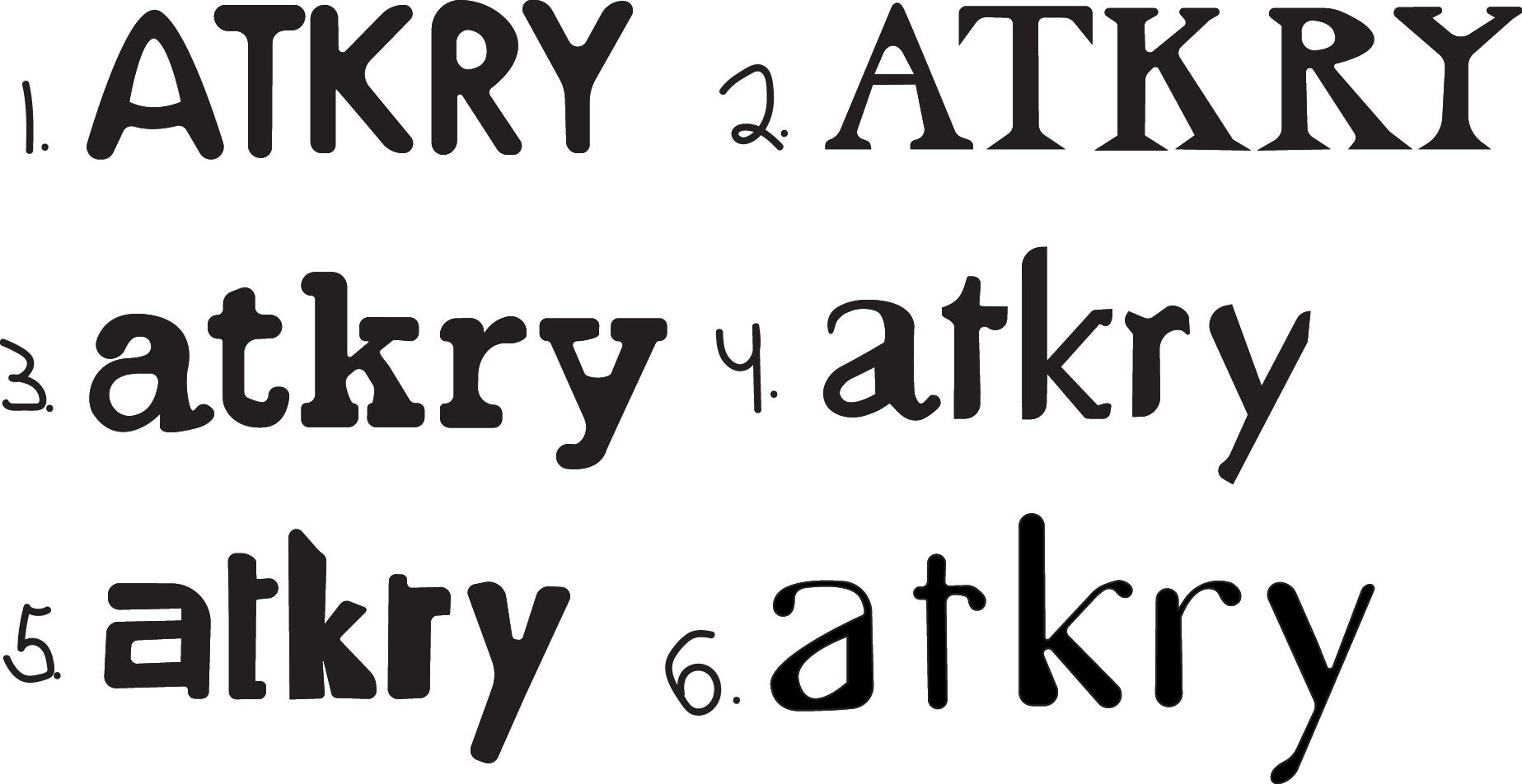
Sketches

|
|
Figure 2.1 - Design Sketches, Week 8 (21/10/2022) |
I used grids in my font designs because I thought it would help me create a typeface that is appropriate for this purpose.

|
|
Figure 2.2 - Design Sketches, Week 8 (21/10/2022) |
 |
| Figure 2.3 - Design Sketches, Week 8 (21/10/2022) |
I made a couple designs using Illustrator after doing some study on font design to make sure they were clean and exact. Design #4 is one of the more preferred designs because, although being rather straightforward, I believe it has a lot of personality. I appreciate the symbolistic style they have, which allows for a more fascinating design, and it is based on ITC New Baskerville Std.
Identify and Deconstruct References

|
|
Figure 3.1 - Deconstructed "n" - ITC New Baskerville Std
reference, Week 8 (21/10/2022) |

|
|
Figure 3.2 - Deconstructed "t" - ITC New Baskerville
Std reference, Week 8 (21/10/2022) |

|
|
Figure 3.3 - Deconstructed "r" - ITC New Baskerville
Std reference, Week 8 (21/10/2022) |
Deconstructing these letters has shown me that, while they appear to be
identical, they are not. The 'n' shoulder has an overshoot to create a
pleasing curve and make the letter proportional. To make it consistent
with 'n,' the shoulder of 'r' is given a minor overshoot. The terminal
of 't' is also utilized to achieve the same proportion and consistency
effect.
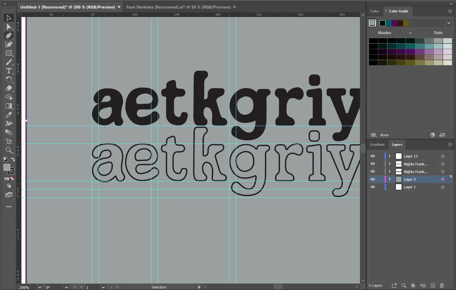
Digitalize Final Font Design

|
| Figure 4.1 - Guides and digitalized font design, Week 9 (21/10/2022) |
Measurements (from baseline)
Ascender: 757 pt
Capital height: 670 pt
Median: 500 pt
Descender: -205 pt
Ascender: 757 pt
Capital height: 670 pt
Median: 500 pt
Descender: -205 pt

|
| Figure 4.2 - Digitalized progress, Week 9 (28/10/2022) |
|
| Figure 4.3 - Measuring thickness, Week 9 (28/10/2022) |
I created the grids based on the qualities of the letters and are evenly split. Before turning a design into a fully functional typeface, the ascender and descender dimensions are changed for each iteration I create.

|
| Figure 4.4 - Comparing contrasts, Week 9 (28/10/2022) |
I made many versions since I wanted to be able to fine-tune the design as much as possible. Even though the intention for my font is to seem like an old typewriter font, I believed the thickness for a, e, g, and p would be too uneven. Personally, I enjoy irregularities, but since the goal of this work is to make a consistent font, I will attempt to produce an aesthetically inconsistent yet consistent font.

|
|
Figure 4.5 - Digitalized Font, Week 9 (28/10/2022) |
Developing The Final Font

|
| Figure 5.1 - Copying and pasting the letters into FontLab 7, Week 10 (31/10/2022) |
Following the completion of my typeface, I copied and pasted all of my
letters from Adobe Illustrator to FontLab 7. I had to make some small
tweaks after I pasted my letters to ensure that everything was in order.

|
|
|
|
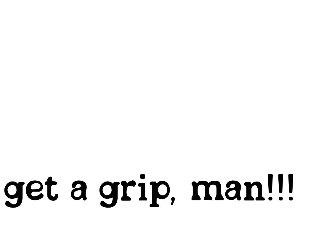
| Figure 5.3 - Sample text, Week 10 (31/10/2022) |
As soon as I installed the font on my laptop and exported the font, I made the decision to write a sample text to test the font's functionality.
Final Outcome

|
|
Figure 6.1 - Draft display poster, Week 10 (31/10/2022) |

|
| Figure 6.2 - Draft display poster, Week 10 (31/10/2022) |
Here is a straightforward poster I created to display the completed font
design.
Final Task 3: Type Design and Communication
This is Inkdribble ttf.

|
|
Figure 7.1 - Final Task 3 "Inkdribble" - JPEG, Week 10 (5/11/2022) |
 |
Figure 7.4 -"Inkdribble" Typo Poster A4 - JPEG, Week 10 (5/11/2022) |
Figure 7.3 - Final Task 3 "Inkdribble" - PDF, Week 10 (5/11/2022)
Figure 7.4 -"Inkdribble" Typo Poster A4 - PDF, Week 10 (5/11/2022)
FEEDBACK
Week 8: N/A
.Week 9: N/A
Week 10:
General Feedback: Each letter lacks consistency,
making the font design appear disorganized and ineffective.
Always preserve a backup copy of our designs in case of an
emergency that forces us to lose them.
Specific Feedback: It is quite evident from the font
design that it is not really consistent throughout. A prominent
indicator of inconsistency in my font design is that when I
replicated my font's core characteristic, each of the letters
had distinct qualities, which impacted my font design. Another
sign of inconsistency is the width of each letter; most of the
letters had a combination of thick and thin strokes, making the
entire typeface seem cluttered and unpleasant. To improve, I'll
have to go back and focus on one or two core characteristics
while keeping everything constant and the same.
REFLECTIONS
Experience
This project using typography has so far been a lot of fun for me.
The process of creating my first typeface design was intriguing. The
creative process and typeface creation were the most enjoyable
parts. Even though it was my first attempt, I'm pleased with how it
came out, but I believe I can still do better. I also developed my
observational abilities and learnt the fundamentals of font
creation.
I've noticed that while most fonts appear uniform and even, there
are a lot of changes such as overshoots and proportions to make it
appear consistent. Such subtleties and minutiae are vital when
developing a typeface since they create a consistent font when
viewed.
Findings
Findings
I discovered that developing a typeface is a difficult process with
many technical considerations. I learned this after receiving harsh
criticism for being careless with my designs. The difference between
stroke and stem widths was quite important while drawing various
designs. Contrast makes each letter seem consistent and appealing.
FURTHER READING
Figure 7.1 - Typographic Design: Form and Communication
Reading this book has improved my typeface design skills. The book discusses mechanical and mathematical letterform creation, which can lead to major spatial issues when different forms within an alphabet look optically erroneous.

|
| Figure 7.2 - Optical relationships within a font |
Due to the fact that many forms within an alphabet seem visually erroneous, mechanical and mathematical letterform creation can generate major spatial issues. These variations of typefaces demonstrate the optical correction required to establish aesthetic harmony within a typeface. These modifications are typically invisible to the reader because they are so subtle. However, they produce a more unified and organized appearance when combined.

|
|
Figure 7.3 - Unity of design in the type font |
The typographic typeface has an enormous range of shape. It must be possible to effectively combine 26 capital letters, 26 lowercase letters, 10 numbers, punctuation, and other visual components into a system that can produce an infinite number of words. A typeface's repeated curves, verticals, horizontals, and serifs work together to add variation and cohesion to typographic designs. This idea of repetition with variance can be seen in all well-designed typefaces.

Comments
Post a Comment