Typography // Task 1: Exercises

29.08.2022 - 30.09.2022 / Week 01 - Week 05

Hasnol Rafiq bin Hasnol Raduan / 0356767

Typography/ Creative Media/ Design School

Task 1: Exercises 1 & 2


LECTURES

Lecture 1 - Development

Early letterform development: Phoenician to Roman

Writing at first included using a pointed stick to scratch into wet clay or a chisel to carve into stone. It is clear that these resources—tools and materials—led to the development of uppercase letterforms. Uppercase shapes are a straightforward blend of straight lines and fragments of circles, as necessitated by the instruments and materials of early writing.

Fig 1.1 - Evolution from Phoenician letter. 

Phoenicians used a right-to-left writing style. The Greeks created a kind of writing known as "boustrophedon," in which the lines of text alternated between reading left to right and right to left.

Hand script from 3rd – 10th century C.E.

Roman monuments' written version is represented by square caps. Serifs have been added to the ends of the major strokes of these letterforms.

Rustic capitals, a condensed variation of square caps, used much less time to write and could fit twice as many words on a piece of parchment. Rustic capitals were quicker and simpler, but since they were compressed, they were a little more difficult to read.

Roman cursive features were included into the Uncials, particularly in the shapes of the letters A, D, E, H, M, U, and Q. Rustic capitals are less legible at tiny sizes than the wide shapes of uncials.

2000 years after the invention of the Phoenician alphabet, the cursive hand is once again formalized, complete with ascenders and descenders.

All church writings were to be standard by 789, per an order of Charlemagne. The handwriting used by the monks to rewrite the words in majuscules, tiny, capitalization, and punctuation became the norm for a century.

Blackletter to Gutenberg’s type

Regional modifications to Alcuin's writing appeared with the fall of Charlemagne's empire. Textura, a condensed, sharply vertical letterform, became popular. The term "rotunda" for a rounder, more open hand became popular in the south.

They were all brought together by Gutenberg to create pages that faithfully reproduced the writing of the scribe's hand. Each letterform in his type casting required a distinct brass matrix, or negative imprint.

Blackletter, the first printing type, was created around 1450 and was modelled after the hand-copying techniques then employed in northern Europe for books.

Fig 1.2 - Cloister Black/ Goudy Text.


Lecture 2 - Text Formatting

The automated modification of the distance between characters is referred to as "kerning." It is frequently mispronounced as "letterspacing." Letterspacing refers to the practice of adding space between letters, whereas tracking refers to the process of adding and removing space from a phrase or sentence.

Fig 2.1 - Kerning / With and Without.


Lowercase letterforms require the counterfort formed between letters to sustain the line of reading, but uppercase letterforms are made to be able to stand on their own.

Choosing a text type that is simple to read for a long time is the objective. The type field should take up the same amount of space on the page as the image.

Text type should be big enough to read comfortably at arm's length.

Leading should spaced properly, for example, tightly spaced text increases vertical eye movement; readers are more likely to lose their position.

As a general guideline, lines should be between 35 and 65 characters long. Reading is hampered by extremely lengthy or short line lengths.

Lecture 3 - Indicating Paragraphs 

There are several ways to mark paragraphs. In the first illustration, we can observe the "pilcrow," a remnant of mediaeval manuscripts that is no longer often used.

Fig 3.1 - Leading vs Line Spacing.

If the line spacing is 12 points, for instance, the paragraph space should also be 12 points. This guarantees cross-alignment between text columns.

Below are some examples of lengthy paragraphs that produce abnormally broad text columns. There may still be compelling compositional or practical arguments in favor of it.

In conventional typesetting, widows and orphans exist. In order to prevent the occurrence of the aforementioned, designers must exercise extreme caution.

Both widows and orphans are regarded as major errors in the justified text. Text with ragged left and flush right edges is somewhat more understanding of widows. Orphans are still impermissible.

The only way to avoid widows is to rebreak all of your line ends such that no paragraph's last line stands out as notably shorter.

Typographers take great care to ensure that no text column begins with the final line of the paragraph before it.

The job of a typographer is to make sure that these headings communicate to the reader in a way that is evident how important each heading is in relation to the others in the text.

There is a hierarchy when a list of subheads is put together.

Fig 3.2 - Hierarchy Within Text.


There are additional methods for expressing hierarchy in language; in fact, the options are essentially endless.

By articulating the complementary vertical rhythms and reinforcing the structure, cross-aligning headlines and captions with text type.

Lecture 4 - Describing Letterforms

Like any art that has developed over 500 years, typography uses a variety of technical words. The majority of them primarily discuss particular letterform elements. Get acquainted with the terminology since it is a good idea. It is considerably simpler to recognize distinct fonts when you are aware of a letterform's constituent elements.

Baseline: The hypothetical line that serves as the letterforms' visual foundation.

Median: Letterform height's imaginary midpoint.

X-height: Lowercase letters' height in any typeface.

Stroke: A line that outlines the fundamental letterform

Apex and Vertex the resulting point obtained by connecting two diagonal stems

Short strokes that emerge from the letterform's stem, either horizontally (E, F, or L) or upwardly inclined (K, Y).

Ascender The portion of the stem of a lowercase letterform that projects above the median.

Barb The half-serif finish on some curved stroke

Beak The half-serif finish on some horizontal arms.

Bowl The rounded form that describes a counter. The bowl may be either open or closed.

Bracket The transition between the serif and the stem

Cross Bar The horizontal stroke in a letterform that joins two stems together

Cross Stroke The horizontal stroke in a letterform that joins two stems together

Crotch The interior space where two strokes meet.

Descender The portion of the stem of a lowercase letterform that projects below the baseline.

Ear The stroke extending out from the main stem or body of the letterform.

Em/en Originally refering to the width of an uppercase M, and em is now the distance equal to the size of the typeface (an em in 48 points, for example). An en is half the size of an em. Most often used to describe em/en spaces and em/en dashes.

Fig 4.1 - Em/en Example.


Finial The rounded non-serif terminal to a stroke
Leg Short stroke off the stem of the letterform, either at the bottom of the stroke (L) or inclined downward (K, R).
Ligature The character formed by the combination of two or more letterforms.
Link The stroke that connects the bowl and the loop of a lowercase G.
Loop In some typefaces, the bowl created in the descender of the lowercase G.
Serif The right-angled or oblique foot at the end of the stroke

Lecture 5 - Understanding Letterforms

Numerous capital letter shapes imply symmetry, yet they are not actually symmetrical. The Baskerville stroke form has two distinct stroke weights that are clear to notice, but what stands out more is the distinctive arc that each bracket has that joins the serif to the stem.

Although the capital letter shapes appear to be symmetrical, closer inspection reveals that the left slope is narrower than the right stroke. The great attention a type designer takes to produce letterforms that are both internally unified and individually expressive is seen in both Baskerville and Univers.

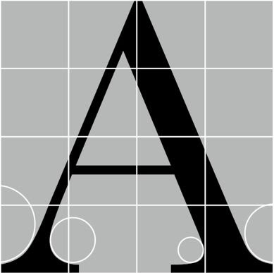
Fig 5.1 - Baskerville Uppercase.

Examining the lowercase 'a' of two seemingly comparable sans-serif styles serves as a clear illustration of the intricacy of each individual letterform. The obvious contrast in character between the two may be seen when comparing how the letterforms' stems and bowls come together.

Recognizing particular letterforms is crucial, but so is becoming sensitive to the counterform that the space the form's strokes represent. The gaps between letters are included in the word's counterform when they are combined to form letters.

When working with letterforms without counters per se, such as the lowercase 'r,' the latter idea is especially crucial. The way your counters are handled during typesetting affects how smoothly your sentences flow.

Fig 5.2 - Counterform.


The fundamental ideas of graphic design are immediately applicable to typography. The examples that follow are contrasts that have been applied to type using a Rudi Ruegg-created format.

Lecture 6 - Typography in Different Medium

Only until it was printed on paper was typography considered to be alive. Following that, nothing altered. The work of talented typesetters and designers produced clear typography and easy reading. Today, typography may be found on several devices in addition to paper. It is dependent on a variety of variable and mostly unknowable factors, including the operating system, the system typefaces, the device and screen itself, the viewport, and more. Because typesetting now takes place in the browser, how the page is presented affects how we perceive typography.

Type for Print

Long before we read through screens, type was made to be read from print. The designer's responsibility is to make the language easy to read, fluid, and smooth.

Fig 6.1 - Type for Print

Type for Screen

Long before we read through screens, type was made to be read from print. The designer's responsibility is to make the language easy to read, fluid, and smooth.
A excellent typeface for printing: the most often used types for printing are Caslon, Garamond, and Baskerville. They have the distinct quality of being sophisticated and cerebral while still being easily accessible at tiny font sizes.

Hyperactive Link/ hyperlink

A word, phrase, or image that contains a hyperlink allows you to go to a different document or part inside the one you're now reading. By default, text hyperlinks are often blue and underlined. Whether it is text or an image, the arrow should transform to a little hand pointing to the link as you move the cursor over it.

Font Size for screen 

In order to account for reading distance, 16-pixel text on a screen is roughly the same size as text printed in a book or magazine.

System Fonts for Screen/ Web Safe Fonts

Each device has a unique set of pre-installed fonts. which is mostly determined by its operating system. Each varies somewhat, which is an issue.
One set of Windows-based devices may exist. MacOS versions borrow from one another. The Android operating system from Google then makes use of its own.

Motion Typography

Typographers have the chance to "dramatize" type using temporal media, making letterforms "fluid" and "kinetic." Over time, the typographic information in a movie's title credits is presented; frequently, animation is used to bring it to life. Animated type is becoming more prevalent in motion graphics, especially in the brand identities of film and television production firms.
Ads and music videos frequently have type layered on them, frequently moving to the beat of the music. In order to represent a set of brand values or create the tone of linked material, on-screen typography has evolved to become more expressive. Typography used in title sequences must evoke a specific mood in order to prepare the viewer for the movie.

PHYSICAL CLASSES:

Week 1: I attended the general brief regarding the Typography modules and what we will have to do in the future. Mr. Vinod Nair introduced us to all the resources we required for Typography on Facebook, which includes, 10 different fonts that we needed to install, sample e-portfolios from past students and even books that we can read to help us further our skills in our own time. 

Week 2:I have completed my assignment on creating different typefaces for four different words. After, Mr. Vinod Nair gave me feedback on the draft designs I gave in and showed me on what I can improve upon.

Week 3: After completing my final designs for each texts, Mr. Vinod Nair taught us how to animate each of the four texts that follows the effect that we gave our texts. To practice learning how to animate, I started by following the YouTube video given by Mr. Vinod Nair and animated the word SINK. 

Week 4: We finished creating our final animations for the one of the words 4 words that we designed and showcased our animations to the class. Mr. Vinod approved of my SLAM animation when I showed it to him. I watched the text formatting lesson after the animations and then got to work on the second task.


INSTRUCTIONS


Task 1: Exercises  - Type Expression 
The first thing we had to do was design and apply something that matched the meaning of the four words that were provided to us. The supplied words are: 
  • Tired
  • Freeze
  • Sticky
  • Screech
  • Slam
  • Pain

Sketches:


Fig 7.1 - Physical Sketches. (Week 1, 3rd September 2022)


Digitalization

Fig 7.2 - Digitalized Sketches (Week 2, 5th September 2022)


I chose to design SLAM, STICKY, TRIED and SCREECH. Above are my rough sketches of each word. The objective is to understand what the design might be without concentrating on the appropriate details to employ.


Fig 7.3 - Tired Process (Week 2, 5th September 2022)

I created the TIRED type expression by emulating the traditional sleeping Zs cliché by displaying the letters after T. The T seems floppy and drooping, giving the impression that it is sleepy or drowsy. I made this design using the Futura font family.
After receiving Feedback, I decided to place the rest of the letters level with T and instead just have the T distorted because it already gives of a tired feeling with its droopy and fatigued nature.

Fig 7.4 - Sticky Process (Week 2, 5th September 2022)
 
The letter a was compressed to provide the stuck effect in the STICKY type expression. I designed a slimy look that originated from the type expression to emphasize how sticky it was. I made this design using the Futura font family.
After receiving feedback, I have decided to reduce the amounts of illustration on the text and instead have it between two letters, because having it between to letters still allow the text to stay a text but also effectively convey the effect of stickiness.


Fig 7.5 - Slam Process (Week 2, 5th September 2022)

I set the letters on a horizontal flip and added motion blur to the M to simulate movement in order to make the M appear to be crushing the other letters to produce the SLAM effect. The addition of the motion blur has a significant influence on the remainder of the type expression. I made this design using the Futura font family.


Fig 7.6 - Screech Process (Week 2, 5th September 2022)

By clipping the letters to a sort of wavy pattern to evoke a noise effect, I create the SCREECH type expression. I chose to add a second wavy filter to the end of the type expression to simulate sound frequencies after adding the noisy pattern to the end of the text. This would create an effect that the type expression is being loud. I made this design using the Futura font family.
After receiving feedback, I have decided to go back to my second design for screech and also add a little bit of a wave effect on the letters to still emulate the image of sound frequencies.


Fig 7.7 - Final Type Expression/JPEG (Week 2, 9th September 2022)


Following the feedback session, there were too many unnecessary illustrations given to all the typefaces, with the exception of SLAM which had a good balance of effects and text. To improve the rest of the typefaces, I decided to cut back on the effects for SCREECH and instead just have the waves, therefore the text is still in its original font while still being able to portray the effect of sound frequencies. I decided to only leave the effect of T for TIRED because it had already portrayed tired well enough without the need for any other effects. I also decided to add all the illustrations of stickiness on a small portion of the word sticky to make sure to not overwhelm the text with illustrations while still showing stickiness.


Fig 7.8 - Final Type Expression/ (Week 2, 9th September 2022)


Type Expression Animation
Fig 8.1 - Test Animation (11th September 2022)

Using the tools in Illustrator and Photoshop to construct the basic type animation for SINK seen in the video tutorial offered by Mr. Vinod. This is an example of a straightforward test animation I created to gain a broad sense of how to animate the required text.

Fig 8.2 - Animation Trial 1 (11th September 2022)


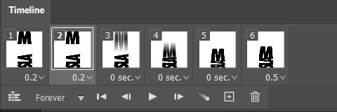
Fig 8.3 - Animation Trial 2 (12th September 2022)

When I was having trouble creating the stickiness on the word STICKY, I tried adding a bounce to give it a more fluid motion because it otherwise felt a little robotic.

Instead, I decided to animate SLAM because I believe that doing so will make the picture of the letter M smashing the other letters stand out more clearly. It was also one of the better ideas in my opinion for this exercise.

Fig 8.4 - Timeline of Animation (12th September 2022)

6 frames were utilized in total for this animation. There was no need for any unnecessary features that would have complicated such a straightforward animation.

Fig 8.5 - Final Animation/GIF (12th September 2022)


Task 2: Exercise - Formatting Text


Fig 9.1 Format With Kerning (Week 4 24th September 2022)


Fig 9.2 - Format Without Kerning (Week 4 24th September 2022)


Fig 9.3 - Difference between With Kerning and Without Kerning (Week 4 24th September 2022)


For this activity, we were to design a layout with a strong visual hierarchy and spatial alignment using our understanding of kerning, leading, and paragraph spacing. I utilized Adobe InDesign to make these layouts, which allowed me to clearly show off my layout-making abilitiesTo show that I have done the kerning, I placed the formats on top of each other and reduce the opacity to show how much kerning has been done.


Fig 9.4 - Layout Progress (Week 4 24th September 2022)


I experimented with many compositions and layouts to determine which one would best showcase my formatting abilities and aid in the development of my final text format. I started modifying the kerning, leading, and arrangement of the words after drawing inspiration from the previous layouts for my final text format.


Final Text Formatting


Fig 9.5 - Final Text Formatting Without Grid (Week 4 24th September 2022)

Fig 9.6 - Final Text Formatting With Grid (Week 4 24th September 2022)


Fig 9.7 - (Week 4 24th September 2022)


Font/s: ITC Garamond Std (Booking), Futura Std (Bold)
Type Size/s: 9 pt (Body Text}, 17 pt (Heading}
Leading: 11 pt (Body Text), 22 pt (Heading)
Paragraph spacing: 11 pt

Characters per-line: 55 Characters
Alignment: Left Align

Margins: 12.7 mm (Top), 100 mm (Bottom)
Columns: 4
Gutter: 5 mm


FEEDBACK

Week 1  
Specific Feedback: Out of all my draught designs, the one for SLAM was the most successful since it was able to effectively represent the concept and mood of SLAM without distorting the typeface or include any pointless illustrations. I should scale back the effects for SCREECH because they make the text messy and overwhelming.

General Feedback: To express the content and emotion of each text, the majority of my designs rely far too heavily on illustrations. The number of effects and illustrations should be cut back. Overall, the message and mood of the text were well communicated through my designs.

Week 2
Specific Feedback: After changing my designs following last week's feedback, my designs for my typeface were satisfactory. It did not use too many illustrations and it also represented the texts meaning well.
General Feedback: The designs are satisfactory and fit the purpose of the exercise given. 

Week 3
Specific Feedback: My designs are ready for animation. I should reduce the amount of motion blur on the M and allow for a pause at the end to create a more solid animation.
General Feedback: I should create a pause at the end of my animation. 

Week 4
Specific Feedback: My animation for SLAM was good enough that I do not need to add any amendments to my design. What I could do is instead make the S slam into the rest of the letters, but i will keep it the same as I feel like my current animation coveys SLAM very well. 
General Feedback: It is good and does not need that much change.

Week 5
Specific Feedback: My layout had a lot of problems. One of the issues that my layout faced is that it did not have any visible cross alignment which made layout less pleasing to look at. Another issue was that my layout did not have a good leading which made it look to compressed. My font also had the same issue which made my layout too compressed.    
General Feedback: Fix the font to be less bold and stretched as well as adjust the leading so the paragraphs look less compressed. 


REFLECTIONS

Experience 
Through completing this task, I become more familiar with typography's foundations. The limitation of only 10 typefaces and the restriction on integrating illustrations in the texts made it tough to come up with ideas. The most difficult element was resisting the want to create drawings that resembled those of my peers. It was exciting to see how my typographic concepts came to life when I learned how to use Photoshop to create animations. There was a learning curve for me because I had never used InDesign before and the formatting and layouts were different. The text formatting exercise took a long time since kerning each line required a lot of labor. Given the variety of layouts I might have done, it was challenging to come up with a satisfactory arrangement.

Observations
I've noticed that typography makes extensive use of design principles and that alignments have an impact on a layout's visual weight and impression of hierarchy. The different letter forms all use design concepts.

Findings
Contrary to what I thought, I've learned that typography adheres to a set of principles and doesn't actually permit much creative freedom. I discovered that there is still a lot of potential for creativity in typography, even with all the restrictions that must be observed. Additionally, I discovered that Photoshop can be used to make animations. Through trial and error, I was able to develop the skills necessary to produce fluid animations for my fonts.


Further Reading

TYPE PRIMER 2ND EDITION
by John Kane


Fig 10.1 - Type Primer, A 2nd Edition by John Kane


This work, which is geared for starting design and typography students, helps them comprehend and apply the fundamentals of type. It distinguishes between what is proper and what is just show by concentrating on intent and content and making educated decisions. It assists students by carefully directing them to the point where they can show fundamental typographic concepts and so enhance their own typographic intuition. It is packed with examples, exercises, and background material.

Fig 10.2 - Tracking: kerning and letterspacing (pg. 101)

In this chapter, it is discussed how the term "kerning" refers to the automated modification of letter spacing in accordance with a table encoded inside the digital font. 

The term "letterspacing" is misused since kerning eliminates the space between letters; yet, letterspacing really involves increasing space between letters. The process of adding or removing space between letters is known as "tracking" in the majority of computer applications that employ typesetting.


Comments

Popular Posts