Advanced Typography // Task 3
03/05/2023 - 31/06/2023 // Week 9 - Week 13
Hasnol Rafiq Bin Hasnol Raduan / 0356767
Advanced typography / Bachelor of Design (Hons) in Creative Media / Taylor's Design School
Advanced typography / Bachelor of Design (Hons) in Creative Media / Taylor's Design School
INSTRUCTIONS
TASK 3
RESEARCH, IDEATION AND SKETCHES

|
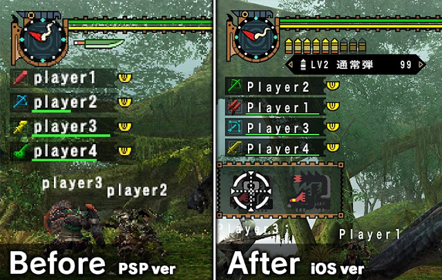
| Figure 1 - Font Inconsistency #1 (10/06/2023) |

|
|
|
The fantastic world-building and engrossing adventures in Monster Hunter
have kept me interested for a long time, but the inconsistent letterforms
across various versions of the game have always been a distraction.
This side-by-side comparison of two versions of the game demonstrates the
game's extremely mechanical typography and user interface (UI). The
typeface would be created such that it seems natural and complements the
angular style. If done, the game's letterform would be instantly
recognizable and the game's aesthetic would be finished.
FONT RESEARCH
|
|
|
|

|
|
|
The bestiary in Monster Hunter is filled with amazing monster icons that are visually stunning. Each one is carefully designed to capture the unique features of every creature. It's a treasure trove of incredible artwork. The icons really capture the essence of the game's huge ecosystem. They showcase the power, mystery, and variety of the monsters beautifully. By embracing this symbolic language, we can draw from the potential to create a truly captivating typographic experience. I carefully examine their shapes, outlines, textures, and unique characteristics. When I break down these elements, I am creating the basis for a font that truly captures the essence of these mythical creatures.
Designing Font

|
|
|
The fonts Chokokutai Regular and ZCool Regular were selected as
inspiration because of their jagged and bendy elements. The typeface
aims to capture the thrill by using jagged edges that remind us of the
heart-pounding moments in intense battles. I want to create angular
shapes, uneven lines, and jagged edges in my lettering. I want each
letter to capture the intense energy and urgency of the hunt. I find
that the jagged fonts used in Monster Hunter really capture the intense
and fierce nature of the game. But I also draw inspiration from the
game's vast and beautiful landscapes, peaceful environments, and the
intricate and stylish armor designs. Straight bend fonts give us the
ability to add a hint of elegance and harmony to the typeface.

|
| Figure - Font Attempt #1 (18/06/2023) |
When I started working on my font design, I wanted to capture the same jagged edges found in the icons and emblems of Monster Hunter's bestiary. To achieve this, I focused on using only jagged edges and avoiding any curved bends. I wanted to capture the intimidating presence of the monsters and the strong, sharp features that were a defining aspect of the game's visual style. In order to make the creatures appear even more fierce, I decided to incorporate sharp fangs into certain letters. This was done to mimic the intimidating claws and teeth that are characteristic of these monsters. As I continued working on my first attempt, I faced a major obstacle: there were inconsistencies in the font design. Although the idea of using jagged edges and sharp fangs for the letters seemed promising, it turned out to be challenging to keep them consistent and cohesive throughout. I had trouble creating smooth transitions between the letterforms because there weren't any curved bends. This made the font look unbalanced and hard to read. I realised that the way I initially approached the design of Monster Hunter's UI didn't match the overall look and user-friendliness that was expected.

|
| Figure - Font Attempt #2 (20/06/2023) |
In my second attempt, I tried to find a middle ground between sharp angles and smooth curves. I took inspiration from the icons and emblems found in Monster Hunter's bestiary. I wanted to give the font a captivating essence inspired by the game, while still keeping a mechanical and practical look. I wanted to combine these elements to make a design that fans would really connect with and that would fit perfectly into the game's user interface. As I continued, I faced a tough challenge - the tricky job of bringing together different design elements that were quite different from each other. Finding the right balance between jagged edges and curved bends was a challenging task. Even though they tried to keep a mechanical appearance, the font ended up looking messy and visually disorganized. I find the idea of adding sharp fangs to certain letters quite interesting, but it also made things more complicated and disrupted the overall flow. When these elements were put together, it ended up being too much and not visually pleasing. The font's sharp fangs, inspired by the game's monsters, made it look cluttered and disjointed.
During my third attempt at designing fonts, I decided to follow the advice
of creating a grid. This grid would act as a structured framework for
building my typeface. I used a grid that reminded me of the number 8 to
create a consistent structure for each letter. This helped me maintain a
sense of harmony and cohesion in the font. The grid became like a guide,
showing the way to create each letter of the typeface. I made sure to
follow the grid's rules when working on the design. This involved removing
specific strokes while also carefully aligning the letterforms to ensure
they were still easy to read and visually pleasing. This approach created
a feeling of consistency and visual harmony.

|
| Figure - Font Strokes (25/06/2023) |
I used this carefully designed grid to help me make sure that the font I was creating had perfect alignment and consistent proportions. By basing my design on this organized framework, I created a typeface that seamlessly fits into the vibrant visual world of Monster Hunter. Using the grid as a tool, I took great care in crafting each letter, making sure to focus on proportions, angles, and symmetry. The grid was like a visual blueprint that helped with placing strokes and spacing letters accurately. It made sure that every letter fit seamlessly into the immersive world of the game. When I set out to design a typeface inspired by Monster Hunter, I found that the grid played a crucial role in striking the right balance between staying true to the game's aesthetic and ensuring legibility. I made sure to align the letterforms to the grid, which helped me maintain the visual style of the game while also making sure the text is easy to read.

|
| Figure - Font Shapes (25/06/2023) |
Font Forge is a powerful font editor that is available for free. It allows designers to create detailed and unique typefaces. I believe that its accessibility and abundance of features make it the perfect choice for my font. When I want to smoothly transfer the carefully designed letters from Adobe Illustrator to Font Forge, I faced a challenge. This challenge requires me to separate each letter and character onto their own artboard.
Here is the font file: https://drive.google.com/drive/folders/10zSOpqk-ZIs90yG4GC1txR_YVIkDhvFe?usp=sharing
I use Photoshop to replace the existing text in menus, buttons, and informational displays with the typeface. This helps maintain a cohesive and visually appealing design within the Monster Hunter UI. I want to make the game even more exciting and immersive by using the font in the game's user interface. It will give players a sense of adventure and awe, making their overall experience even better. When typography is seamlessly integrated, it becomes a crucial part of the game's visual storytelling, enhancing the emotional connection between players and the game world.
APPICATION AND PRESENTATION OF FONT

|
| Figure - Font In Game UI (02/07/2023) |
I use Photoshop to replace the existing text in menus, buttons, and informational displays with the typeface. This helps maintain a cohesive and visually appealing design within the Monster Hunter UI. I want to make the game even more exciting and immersive by using the font in the game's user interface. It will give players a sense of adventure and awe, making their overall experience even better. When typography is seamlessly integrated, it becomes a crucial part of the game's visual storytelling, enhancing the emotional connection between players and the game world.

|
| Figure - Font Poster (02/07/2023) |
When I use my Monster Hunter-inspired typeface to create a poster, it brings
the game's captivating universe to life in a visually stunning and immersive
way. I have the ability to tell a compelling story through typography,
capturing the very essence of Monster Hunter and captivating those who see
it.
Figure - Font Presentation (02/07/2023)
FINAL DESIGN
Final Font Download: https://drive.google.com/drive/folders/10zSOpqk-ZIs90yG4GC1txR_YVIkDhvFe?usp=sharing
Figure - Final Font Applications
Figure - Final Font Presentations
FEEDBACK
Specific Feedback: My instagram layout utlisies the colour pallette very well. Theres a very clear theme and direction that the instagram had. My post that includes my face should relate to the theme or at the very least be a proper picture. My proposal didn't have a strong understanding of what experimental meant
Week 10
Week 10
Specific Feedback: My rationale for task 3 is very sound and theres a clear direction. I should start by research and studying different fonts before constructing.
Week 11:
Week 11:
Specific Feedback: My letterface had alot of inconsistency due to the fact that I designed them using shapes instead of the pen tool. I was advised to design a grid and utilise strokes.
Week 12:
Week 12:
Specific Feedback: My letterface has improved but I struggled with designing the letterface with a grid. I was given a new grid to tryout a new style for my letterface.
Experience
REFLECTION
While working on my Monster Hunter font for this assignment, I went through a range of emotions including excitement, satisfaction, and facing various challenges. It was really nice to have the freedom to choose my own project and design something that I truly enjoyed. It felt like a breath of fresh air. I'm really happy with how everything turned out. It's exactly what I had in mind from the beginning. A great advantage of this task is that I can now use this new type design in my future projects. Adding a unique touch to my portfolio not only showcases my creativity but also highlights my versatility as a designer. I'm amazed at how I was able to incorporate the artwork I made over the previous semester break into a university project. Using a variety of skills and resources in different areas is both effective and satisfying.
Observations
Findings
Observations
Generating the font in FontForge and managing my time effectively were the most challenging aspects of this task. As the deadline got closer, I felt like I was in a race against time. I had to prioritise finishing the task over paying attention to small details like kerning,. I was surprised to find myself struggling with time management, especially since I've always been able to handle my typography projects well in the past.
Findings
Creating the Monster Hunter font was an incredible journey filled with excitement, satisfaction, and a fair share of challenges. Having the freedom to choose my own project enabled me to create something that I genuinely enjoyed. Although I faced challenges with time constraints and FontForge, I am excited to use this font in my future projects and apply the knowledge gained from this experience to enhance my typographic abilities.
FURTHER READING
 |
| Figure - The Elements of Typographic Style Robert Bringhurst 1992 |


Comments
Post a Comment