Design Principles - Final Project: Visual Analysis
1/11/2022 - 29/11/2021 / Week 10 - Week 14
Part 1: Visual Analysis
- Select a design of your choice (Poster/Billboard/Illustration/etc).
- Conduct a visual analysis of the design in about 500 words
Part 2: Design
- Produce a work of design, in A4 or A3 size, inspired/influenced by the design you have analyzed, or as a reaction to it.
- Write a 150-200 word rationale for your design.
I selected the artwork you see because it effectively conveys the issues
of economic inequality and unfairness in general. This is highlighted by a
figure of a hand holding up a group of wealthy individuals over others who
appear to be less priveleged. Additionally, it appears that the difference
between the two groups of people is the main inequality that the artist is
attempting to depict in his work. Overall, the artwork effectively and
aesthetically conveys the problem of economic inequality.
Victo Ngai created a digital illustration titled "Humanitarian Raid,
Mother Jones." My observations of the visual aspects include the colors
grey, green, and, for contrast, brilliant yellow and orange. The higher
class colors are on the bright color tone with a strong dynamic orange and
yellow that helps them to stand out, however the backdrop is still a dreary
gloomy grey tone to it, producing an overall depressing composition. A
setting is created around the topic of the artwork by using recurrent design
elements that are visible throughout the layout. A hand appears to be
holding the top class as the lower class struggles underneath them.
The wealthy people are highlighted with vibrant yellow, which furthers the
establishment of a visual hierarchy and directs attention in the direction
of the figure. The artist also employed color to emphasize and create
significant contrast. A figure that stands out and is painted in a distinct
color scheme represents the "poor" residents above all others, emphasizing
this. By making the contrast the major focus of the artwork, contrast serves
as more than just a means of drawing attention to the design's focal point
and provides visual interest for viewers. Because the lower individuals and
the hand are colored in contrast to everything else, which has strong grey
tones, emphasis can also be seen on them. This encourages viewers to pay
greater attention to the other figures in the artwork. The hand appears to
indicate balance and contrast between the lower and higher individuals
equally. As they appear to be in very different circumstances from one
another, underlining the inequality and the theme of the artwork, this
effect intrigues the viewers and helps them understand more of the tale that
is going between the two sides. Even though the higher-up individuals are
illuminated differently, if you look at the artwork a bit closer, you will
see that there is unity and harmony throughout. The forms employed also help
the figures blend in and complete the composition.
This artwork appeals to me since it is similar to what I intend to create for my final piece; the composition conveys an effective message while being aesthetically appealing. The artwork itself is really basic and has a clear message, which is exactly what I want to convey with my artwork. The illustration depicts economic disparity by depicting how the upper class unfairly treats people who are less fortunate than them and utilizes them to their advantage. The designer underlines this by making the guy at the top bigger than everyone else, emphasizing economic disparity.
This Fig is similar to the last visual reference in that both portray persons in upper class above those in lower class, but what distinguishes this piece of artwork is the way in which it is illustrated. The drawing of the upper class person is more dramatic and shows a lot more greed and gluttony. Because they are colored with stronger hues, the color chosen generates a lot of contrast between the upper and lower classes, as well as focus on the higher class figure. The general style is more conventional, as seen in old political cartoons.
I had the concept to make something that illustrates how, in society,
individuals with more money have more influence to make things worse for
those who have less. Through my visual study, I have examined several
representations of my subjects in a wide range of styles, and this has given
me ideas for how to make art that conveys a powerful message and effectively
illustrates my theme of economic inequality.
I attempted to create an artwork that highlighted economic disparity. To communicate the notion of greed and gluttony, I drew a big head that takes up most of the area in the artwork, with its mouth wide open swallowing up all the resources in the planet. In addition, to emphasize the notion that the head is a force of evil, I added cliché villainous traits such as sharp teeth, furious brows, and money for eyes. I had sketched buildings demolished and on fire in the backdrop to indicate the destruction left behind by the head, as well as silhouettes of people running to express dread and helplessness without attracting attention away from the head.
My illustration shows a diabolical businessman atop a bland and desaturated planet, clutching a bowl of money and eating the lower class. Figures 2.2 and 2.3 inspired this drawing, however instead of standing on top of people, I placed my figure on top of a bland and desaturated scene. To set the tone throughout the artwork, I used dismal colors to convey a sense of sorrow and misery. Furthermore, I made the businessman larger than the planet to express the concept that the upper class considers itself to be greater and more important than the rest of the world. The artwork depicts themes of economic inequality by conveying the notion that the upper class consumes a large portion of the world's resources in order to feed their own greed, which adversely affects the lower class.
My preliminary design portrays a girl sitting atop a wall of burning cash, with hands reaching out from behind her for salvation. The girl sits atop the money, unresponsive to the pleas for aid. The idea was to convey the notion that individuals in the upper class spend their money like it's nothing while those in the lower class had to desperately reach out and their screams for aid are disregarded. I loved the idea of having solely hands emerge above the money wall since I believed it would make a more striking visual and express the message more clearly.
FEEDBACK
Week 11: Dr. Jinchi read my work and noted that I had picked a suitable topic for my visual analysis and that my rationale and observation exhibited a strong comprehension of analysis and interpretation. For my observations, I should focus on what I see rather than what I think when I see my chosen artwork. I should provide a quick synopsis of the artwork for the rationale, nothing less and nothing more.
Week 12: Dr. Jinchi reviewed over my visual analysis again after I made the required modifications and remarked that I had a strong understanding of my chosen artwork but that I needed to be cautious not to put what I thought in my observation because observation is all about what I see, not what I believe. She also looked at my visual references and agreed they were okay, but I should explain why I picked them. I just had one sketch to show her, and she stated that it has a very clear idea to express, but that I should strive to do additional sketches.
Week 14: Dr. Jinchi was satisfied with both my finished artwork and my visual analysis, however I should try to remove some of the line art from my artwork to make it seem more complete and flow better.
Hasnol Rafiq Bin Hasnol Raduan / 0356767
Design Principles / Bachelor of Design (Hons) in Creative Media
Final Project: Visual Analysis
Design Principles / Bachelor of Design (Hons) in Creative Media
Final Project: Visual Analysis
Instructions
- Select a design of your choice (Poster/Billboard/Illustration/etc).
- Conduct a visual analysis of the design in about 500 words
Part 2: Design
- Produce a work of design, in A4 or A3 size, inspired/influenced by the design you have analyzed, or as a reaction to it.
- Write a 150-200 word rationale for your design.
VISUAL ANALYSIS

|
|
Fig 1.1 - "Humanitarian Raid, Mother Jones" By Victo Ngai https://victo-ngai.com/political |
Observation

|
| Fig 1.2 - "Humanitarian Raid, Mother Jones" By Victo Ngai, Observation Highlights |
Analysis
The depiction in the artwork depicts a gathering of upper-class
individuals enjoying their meals while the lower-class individuals are
left to suffer. The artwork can have a basic compositional sense to it
without anything being too out of balance because the overall design's
composition is asymmetrically balanced. The artwork displays movement,
which is demonstrated by the flow of the cracked floor; the flow of
the cracks points towards the wealthy people in the middle,
demonstrating evidence of visual hierarchy from the way it is laid out
because it is able to draw attention to the people in the middle and
then slowly pay attention to everything else, creating a dramatic
effect.

|
|
Fig 1.3 - "Humanitarian Raid, Mother Jones" By Victo Ngai,
Analysis Highlights |
Interpretation
Victo Ngai may be attempting to depict economic disparity in his works of
art. The wealthy are intentionally raised above the others, signifying
that they belong to a higher social class and enjoy greater advantages
than those who are truly in need. Even if the upper class doesn't truly
need it, they always have an advantage in life, as shown by the artist's
use of the hand. The idea being conveyed by the lower class attempting to
reach out for the hand is that while the lower class frequently requires
assistance or a helping hand, the upper class is given priority in
society. Additionally, the artwork's juxtaposition of the two subjects is
meant to unnerve the viewer and underline the idea of lower class vs.
upper class. Generally speaking, the artwork presents the issue of
inequality in a unique way.
VISUAL REFRENCES

|
| Fig 2.1 - https://pin.it/6OXUdEI |
Figure shows an illustration of global economic inequality. The designer
provides a visual metaphor for how those from the lower class are
constantly out of reach from what they need by having the money dangling
from the sky just out of grasp from the hand at the bottom. The balance
and simplicity of the artwork is truly noteworthy since the designer was
able to produce an effective artwork without displaying too much.
.jpeg)
|
| Fig 2.2 - https://pin.it/Bmv6Yyb |
This artwork appeals to me since it is similar to what I intend to create for my final piece; the composition conveys an effective message while being aesthetically appealing. The artwork itself is really basic and has a clear message, which is exactly what I want to convey with my artwork. The illustration depicts economic disparity by depicting how the upper class unfairly treats people who are less fortunate than them and utilizes them to their advantage. The designer underlines this by making the guy at the top bigger than everyone else, emphasizing economic disparity.

|
| Fig 2.3 - https://pin.it/1jRxuTY |
This Fig is similar to the last visual reference in that both portray persons in upper class above those in lower class, but what distinguishes this piece of artwork is the way in which it is illustrated. The drawing of the upper class person is more dramatic and shows a lot more greed and gluttony. Because they are colored with stronger hues, the color chosen generates a lot of contrast between the upper and lower classes, as well as focus on the higher class figure. The general style is more conventional, as seen in old political cartoons.
SKETCHES

|
| Fig 3.1- Idea Sketch |
I attempted to create an artwork that highlighted economic disparity. To communicate the notion of greed and gluttony, I drew a big head that takes up most of the area in the artwork, with its mouth wide open swallowing up all the resources in the planet. In addition, to emphasize the notion that the head is a force of evil, I added cliché villainous traits such as sharp teeth, furious brows, and money for eyes. I had sketched buildings demolished and on fire in the backdrop to indicate the destruction left behind by the head, as well as silhouettes of people running to express dread and helplessness without attracting attention away from the head.

|
| Fig 3.2 - Idea Sketch |
My illustration shows a diabolical businessman atop a bland and desaturated planet, clutching a bowl of money and eating the lower class. Figures 2.2 and 2.3 inspired this drawing, however instead of standing on top of people, I placed my figure on top of a bland and desaturated scene. To set the tone throughout the artwork, I used dismal colors to convey a sense of sorrow and misery. Furthermore, I made the businessman larger than the planet to express the concept that the upper class considers itself to be greater and more important than the rest of the world. The artwork depicts themes of economic inequality by conveying the notion that the upper class consumes a large portion of the world's resources in order to feed their own greed, which adversely affects the lower class.

|
| Fig 3.3 - Idea Sketch |
My preliminary design portrays a girl sitting atop a wall of burning cash, with hands reaching out from behind her for salvation. The girl sits atop the money, unresponsive to the pleas for aid. The idea was to convey the notion that individuals in the upper class spend their money like it's nothing while those in the lower class had to desperately reach out and their screams for aid are disregarded. I loved the idea of having solely hands emerge above the money wall since I believed it would make a more striking visual and express the message more clearly.
PROCESS DEVELOPMENT


FINAL DESIGN
This artwork depicts the notion of the upper class being regarded as
greater than the earth, consuming all of the world's resources, including
those of the lower class, and leaving the world to burn, expressing the
concept that those with more privileges would take advantage of those who
don't. The artwork portrays a businessman consuming the world's resources
because of greed rather than necessity. The design's somber tone and color
palette emphasize and contrast the inequality between the poor and upper
classes. The design has a nice sense of balance by having the
businessman be the focal point while the rest of the elements in the
design are reduced in size. The guy dangling in front of the businessman's
mouth is an instance of how the lower class in society is sometimes
treated unfairly and exploited by people in the higher class. Closer
examination reveals that the person's color scheme matches the color
scheme of the bowl of resources that the businessman is carrying; this is
intended to communicate the notion that the upper class regards the lower
class as disposable in the same manner that they perceive resources. I
changed the color scheme of the business man slightly more brighter in
tone to contrast how clean and proper the higher class seem while they
take up the world's resources. I included details like vicious fangs,
devil horns, and a tail in the style of stocks rising to indicate that
this figure is sinister and malevolent. When examined closely, the tail
signifies greed and how much the upper class profits from depleting the
world's resources. The background uses a dull tone to imply that the world
is slowly draining away while it burns.


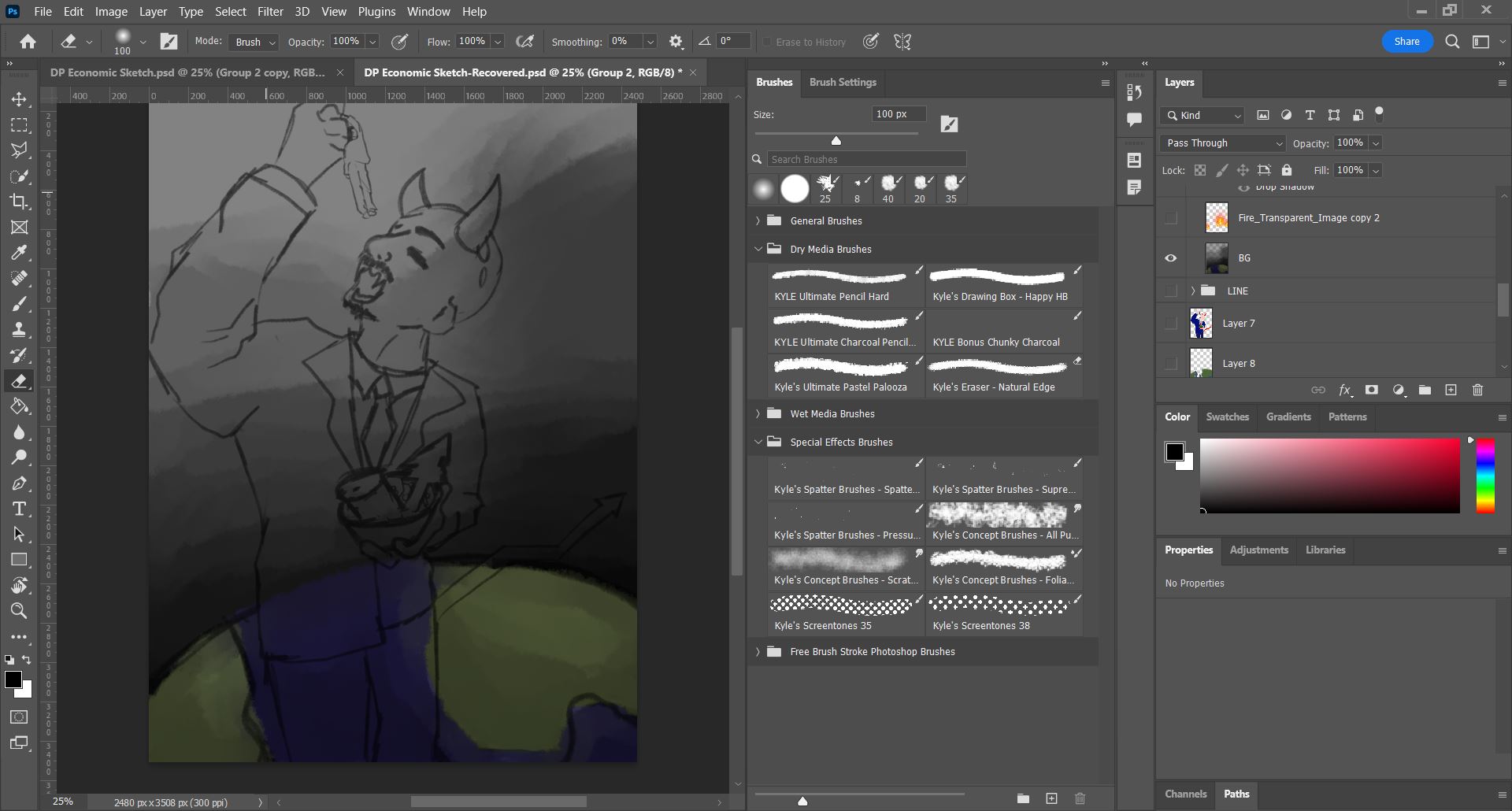
Fig 4.1 - Reference Image // Fig 4.2 - Line Art
I chose to take Fig 4.1 as a starting point for designing the stance
that my wicked businessman would be in. Because it had a distinctive
look to it, I decided this was the greatest image to use to portray a
huge consuming someone smaller.

|
| Fig 4.3 - Changed Contents of Bowl |
Following Dr. Jinchi's criticism, I chose to modify the bowl's
contents from money to oil barrels and trees, as these are the most
prevalent resources used by corporate enterprises. These are also
natural resources, reinforcing the notion that the upper class is
depleting the world's natural resources.
|
| Fig 4.4 - Coloring Background |
I used a prominent dull tone for the backdrop to emphasize how the
world is slowly draining away while it burns. I also thought it would
give the artwork a more serious tone because it is dealing with a
serious issue in the world.

|
| Fig 4.5 - Coloring Line Art |

|
| Fig 4.6 - Adding Fire |
When constructing my design, balance and contrast are clear, with the
businessman being the largest element in the artwork and every other
element being miniscule. The color of the businessman is brighter and
cleaner than the worn out and drab tone of everything else. Gestalt
Theory is also observed when the contents of the bowl are substituted
with world resources rather than snacks, and the tail depicts rising
parts of a stock chart. I put continuous fire in the backdrop to
emphasize a stronger message since I noticed the background consisted
of too many empty areas that could easily be filled up. I opted to
include fire in the background to emphasize the point that the
businessman is literally and metaphorically causing the earth to burn.
It contributes to the concept that economic inequality not only
creates one problem, but a slew of others throughout the world.
FINAL DESIGN

|
| Fig 5.1 - Final Visual Analysis |
FEEDBACK
Week 12: Dr. Jinchi reviewed over my visual analysis again after I made the required modifications and remarked that I had a strong understanding of my chosen artwork but that I needed to be cautious not to put what I thought in my observation because observation is all about what I see, not what I believe. She also looked at my visual references and agreed they were okay, but I should explain why I picked them. I just had one sketch to show her, and she stated that it has a very clear idea to express, but that I should strive to do additional sketches.
Week 13: Dr. Jinchi stated after generating further drafts sketches for my final artwork that all artworks demonstrated the issue of economic inequality pretty successfully. She commented on how the last sketch appeared too casual and easygoing, and she suggested that I avoid the last sketch and instead concentrate on the first two sketches. I opted to produce the second sketch because I believed it best portrayed economic inequality, and Dr. Jinchi agreed, but I should also include components from the first sketch, such as the ruined environment caused by the 'upper class.'
Week 14: Dr. Jinchi was satisfied with both my finished artwork and my visual analysis, however I should try to remove some of the line art from my artwork to make it seem more complete and flow better.
REFLECTION
I had a lot of fun exploring a lot of important subjects with this project, but I was also really hesitant to pursue it because it required a lot of writing, as well as the process of doing research to implement tin my final design. Even though I did not appreciate the writing portion of this work as much as the creating portion, the visual analysis portion allowed me to demonstrate my opinions and expressions in art and design. After writing my visual analysis I learned that in order to create a successful design, I must consider the phases of analysis. My favorite aspect of this challenge was being able to design an artwork based on a serious topic; while most of my artworks have a more relaxing tone to them, I really loved making an artwork with a more serious tone to it.


Comments
Post a Comment