Design Principles: Excersises
30/08/2022 - Ending Date / Week 1 - Week 4
Hasnol Rafiq bin Hasnol Raduan / 0356767
Design Principles/ Bachelor of Design (Hons) in Creative Media/ Design School
INSTRUCTIONS
Week 1
TASK- I attended the general brief and reviewed all the lecture videos and slides regarding the Design Principles, which include: Gestalt theory, Contrast, Emphasis, Balance, Repetition, Movement, Harmony and Unity, Symbol, Word and Image.
I had to choose five design principles in accordance with the requirement, and I had to provide one design for each principle. Balance, Emphasis, Movement, Contrast, and Word/Image are the design principles I have chosen.
1- BALANCE is the distribution of interest or visual weight in a work. A work that is balanced will have all of its components placed so that a design exudes a sense of visual stability. A composition's balance may be achieved by using elements such as objects, values, colors, textures, and forms.
This served as an example of how to employ minimalist components to create a good design as well as how to effectively balance designs without having anything excessive. These designs helped me in my idea investigation for BALANCE because it demonstrates how to correctly balance word text and image without having anything overbearing. It also exemplifies how to use minimalist components to produce a successful design.
1.1- VISUAL REFERENCES
Below are designs that have influenced the making of my design:

|
| Figure 1 - https://visscom.wordpress.com/2013/04/08/the-principle-of-balance/ |

|
|
Figure 1.2 - https://visscom.wordpress.com/2013/04/08/the-principle-of-balance/ |

|
| Figure 1.3 - https://visscom.wordpress.com/2013/04/08/the-principle-of-balance/ |
This served as an example of how to employ minimalist components to create a good design as well as how to effectively balance designs without having anything excessive. These designs helped me in my idea investigation for BALANCE because it demonstrates how to correctly balance word text and image without having anything overbearing. It also exemplifies how to use minimalist components to produce a successful design.
1.2- IDEA EXPLORATION

|
| Figure 1.4 - Balance Exploration #1 |
This is the first draft design for my BALANCED design. The two faces in this design are supposed to represent the two sides of the well-known rapper Kendrick Lamar, and they are supposed to be splitting apart. The symmetrical placement of the two faces demonstrates the design's emphasis on balance.

|
 |
This investigation effectively illustrates the subject of BALANCED, because it successfully divides the space between the vibrant typeface and the skating skater. Although the skater leaves out much of the negative space and the font takes up a lot of it, I think the use of space effectively conveys the idea of BALANCED. The second image is the reference used to sketch out this exploration.
1.3- FINAL OUTCOME
Process:


 |
| Figure 1.6 - Design Process |
This is how my final BALANCED design was created. Since my skateboarder is the major subject of my work, I started by drawing him. I made sure the picture was as true to the reference as possible. To get the melting appearance in my text, I employed a lot of distortion and effects, as seen above.
 |
| Figure 1.7 - Balance Outcome |
I chose to move through with my second design exploration because I thought it made the best use of balance. I added an uneven balance to this piece of art by increasing the bottom-right typography. The skater is less visually impactful than the typography and in order to achieve an asymmetrical balance, I also utilized a stronger color palette.
2.1- VISUAL REFERENCES
Below are designs that have influenced the making of my design:

|
| Figure 2.1 - https://www.instagram.com/reel/CiInynKg5OT/?utm_source=ig_web_copy_link |

|
| Figure 2.2 - https://www.instagram.com/p/CiDLITIMBbP/?utm_source=ig_web_copy_link |
.jpg)
|
| Figure 2.3 - https://www.instagram.com/p/Ch23Gg-OKCq/?utm_source=ig_web_copy_link |
These designs served as inspiration for my final piece of art because they employ a graphic design aesthetic that I find appealing and is in line with what I want to accomplish with my design for EMPHASIS. I think these pieces of art demonstrate focus in a unique way compared to most other designs because they make use of the surroundings to provide a focal point for the artwork.
2.2- IDEA EXPLORATION

|
| Figure 2.4 - Emphasis Exploration #1 |
This is the first exploration for EMPHASIS. The idea was to have a school of fish in the background going into one direction whilst there is one fish that has a different color and going the opposite direction. What would've been emphasized was the one fish in a different color going against the school of fish.
|
| Figure 2.5 - Emphasis Exploration #2 |

|
| Figure 2.6 - Emphasis Exploration #3 |
This third exploration uses a straightforward design and the same result as the majority of the preceding designs that investigate the topic of emphasis. It makes use of repetition and emphasizes one subject out of the subjects that are repeated to provide the impression of emphasis.
2.3- FINAL OUTCOME
Process:
 |
| Figure 2.7 - Visual Reference |


 |
| Figure 2.8 - Design Process |
 |
| Figure 2.8 |
 |
| Figure 2.9 - Emphasis Outcome |
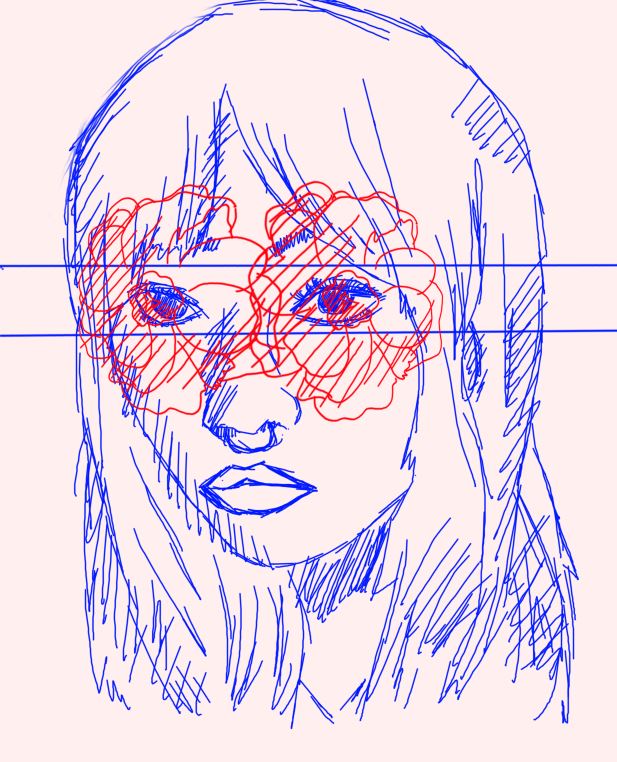
Out of the three design explorations I had, I chose the second one since I believed it was the most intriguing. Before opting to create a design that just accentuates one eye, I went through two drafts that highlighted both eyes. It is simpler for the artwork to have a balance and more of a focus when one eye is highlighted. This effectively conveys focus because it uses contrasting colors and simple patterns to establish a design theme of emphasis.
3.1- VISUAL REFERENCES
Below are designs that have influenced the making of my design:

|
| Figure 3.1 - https://99designs.com/blog/tips/movement-in-graphic-design/ |

|
| Figure 3.2 - https://www.pinterest.com/pin/graphic-design--553872454146429550/ |
These examples provided inspiration for my design approach because they creatively combine lines and geometry to produce a form that helps a design express the impression of movement. I'll be using a lot of the components from these designs in MOVEMENT.
3.2- IDEA EXPLORATION

|
| Figure 3.3 - Movement Exploration #1 |
The design itself is pretty straightforward and makes no use of any complicated aspects; it is my first exploration for MOVEMENT. The simplicity of this design serves to make the effects of movement very obvious and clear. Due to the fact that boxers are recognized for having a lot of movement, a boxer is shown in this design.

|
| Figure 3.4 - Movement Exploration #2 |
The effect of movement is depicted in this second investigation quite differently than it is in the first. Instead of using lines to indicate the direction of movement, lines themselves move while the object of the design remains stationary. Although the design for movement is inverted, the impression is still communicated.
3.3- FINAL OUTCOME
Process:

 |
| Figure 3.5 - Design Process |
This piece's design process is quite straightforward. I wanted to make a design that had movement, so I included flowing lines and a boxer taking a hit. As you can see, though, the lines were insufficient to adequately portray movement, therefore I switched to butterflies flying away in a circular motion.
 |
| Figure 3.6 - Movement Outcome |
I decided to include ideas from both of my exploration. To clearly show movement, I continued to depict a boxer punching, but I also used the lines from my second investigation to indicate the direction of movement. In this design, I used butterflies and bees as a nod to boxer Muhammad Ali's famous quote, "Float like a butterfly, sting like a bee." Originally, I used lines in the backdrop to depict the movement of the boxer being punched, but I later changed my mind and used butterflies flying away from the green boxer to represent the sensation of agony leaving the body. This, in my opinion, provides the impression of MOVEMENT since it makes extensive use of components that suggest the effect.
3.1- VISUAL REFERENCES
Below are designs that have influenced the making of my design:

|
| Figure 4.1 - https://www.pinterest.com/pin/391813236316098106/ |

Figure 4.2 - https://www.pinterest.com/pin/713046553481360189/

|
| Figure 4.3 - https://study.com/academy/lesson/visual-contrast-in-graphic-design-application-effectiveness.html |
The fact that each artist used various complimentary colors to illustrate the contrast concept is why I picked these designs as my visual influences rather than just the way the design is put out. These demonstrate another another way that contrast may be used to create a wide variety of patterns.
4.2 Idea Exploration
 |
| Figure 4.4 - Contrast Exploration #1 |
Instead than focusing on designs, this first exploration of CONTRAST is mostly focused on color. I used a complimentary color for the same reason I used a different shade of the same hue to test whether the impact of contrast could still be conveyed.
 |
| Figure 4.5 - Contrast Exploration #2 |
In my exploration, which was primarily concerned with design subjects, I sought to determine whether or not the impact of contrast could be demonstrated by using two people of various sizes. The contrast between the concepts is furthered by the presence of a body inside a skull.
4.3- FINAL OUTCOME
Process:

 |
| Figure 4.6 - Design Process |
The design approach for this item was likewise rather simple. I created a gradient blur of the skull using tools in Photoshop after using a stock image of a skull as my reference.

|
| Figure 4.7 - Contrast Outcome |
Because I believed the concept subject was a really fascinating one and had plenty of space for creativity, I chose to employ the same design concept as my second exploration for my final design. Instead, I decided to contrast the colors in the design since I believed it would give it a distinctive appearance. I made the design appear to be a space phenomena in order to give my design a stronger narrative.
5. WORD AND IMAGE is a visually discernible object with a specific meaning that is used to communicate ideas with the use of words. Each graphical symbol's title, which may be complemented by an application remark, expresses the meaning that has been ascribed to it.
4.1- VISUAL EXPLORATION

|
| Figure 5.1 - https://www.instagram.com/p/CiKbwVfstOe/?utm_source=ig_web_copy_link |

|
| Figure 5.2 - https://www.instagram.com/p/CfrQ9PMszV8/?utm_source=ig_web_copy_link |

|
| Figure 5.3 - https://www.instagram.com/p/CWyLLK5LUS9/?utm_source=ig_web_copy_link |
These sources had an impact on my design approach since they provided creative and intriguing methods to combine text and graphics while still keeping the result aesthetically pleasing rather than tedious to read.
4.2- IDEA EXPLORATION

|
| Figure 5.4 - Word and Image Exploration #1 |
This initial investigation attempts to demonstrate a distinctive style for the text around the topic while communicating the notion of WORD & IMAGE. In order to avoid making the design monotonous to look at, this design seeks to also establish a harmony and unity between the text and image.

|
| Figure 5.5 - Word and Image Exploration #2 |
In order to develop a theme in the design, I chose to integrate a design into the topic of the design in this additional investigation, which aims to accomplish the same goal as the first exploration. The artwork illustrates WORD & IMAGE with an image of popular musician Frank Ocean and the title of his first musical project.
5.3- FINAL OUTCOME
Process:

 |
| Figure 5.6 - Design Process |

|
| Figure 5.7 - Word and Image Outcome |
FEEDBACK
Week 1
There was no feedback because we just started our exercise therefore there was no work to review.
Week 2
Specific Feedback: Instead of adequately illustrating the design concept of BALANCED, my first piece of artwork for the theme instead showcases CONTRAST or even WORD & IMAGE. Due to the utilization of boxes and color scheme, my artwork for EMPHASIS is quite unimpressive and unpleasant to look at. I may attempt adding additional color to EMPHASIS while creating one of the alternate ideas for BALANCED.
Week 3
Specific Feedback: After deciding to complete one of the other explorations, my artwork for BALANCED has substantially improved. Instead of creating a new design for EMPHASIS, I should remain with the current concept as it still has the potential to become a respectable piece of art. The BALANCED artwork served as the inspiration for CONTRAST, with a few adjustments to make the skull the focal point of the design. MOVEMENT: Although the design's subjects move, more might be added to the composition to imply movement, such as lines. WORD & IMAGE is a respectable effort, but I should have stayed with the initial design because it better illustrated the design approach.
Week 4
Specific Feedback: After presenting my final artwork designs, I found that the majority of them complied with the exercise's requirements. It was suggested that I swap out the photos with my sketches of the concepts for BALANCED and EMPHASIS since doing so would make the designs more unique than if I had simply edited the photos to match the idea. It was also advised that I use butterflies instead of the backdrop line in my MOVEMENT design so that it still conveys movement in a much more realistic way. All of my pieces were appropriate for the task save from that.
REFLECTIONS
It was initially challenging to come up with original concepts that reflected the design ideals. I looked at other people's work on Pinterest, which I find fascinating and motivating, in order to tackle this problem. Dr. Jinchi assisted by providing insightful criticism on each of my concepts. Each design idea is present in a lot of work, I've discovered after conducting extensive visual investigation and analysis. Given that I hadn't previously given design any attention, this challenge gave me a fresh perspective on the subject.


Comments
Post a Comment